VOLT ATHLETICS
BRAND REDESIGN
This project is a brand redesign on a Seattle-based athletic company. I first redesigned their logo, placed a larger emphasis on inclusivity, and made several deliverables.
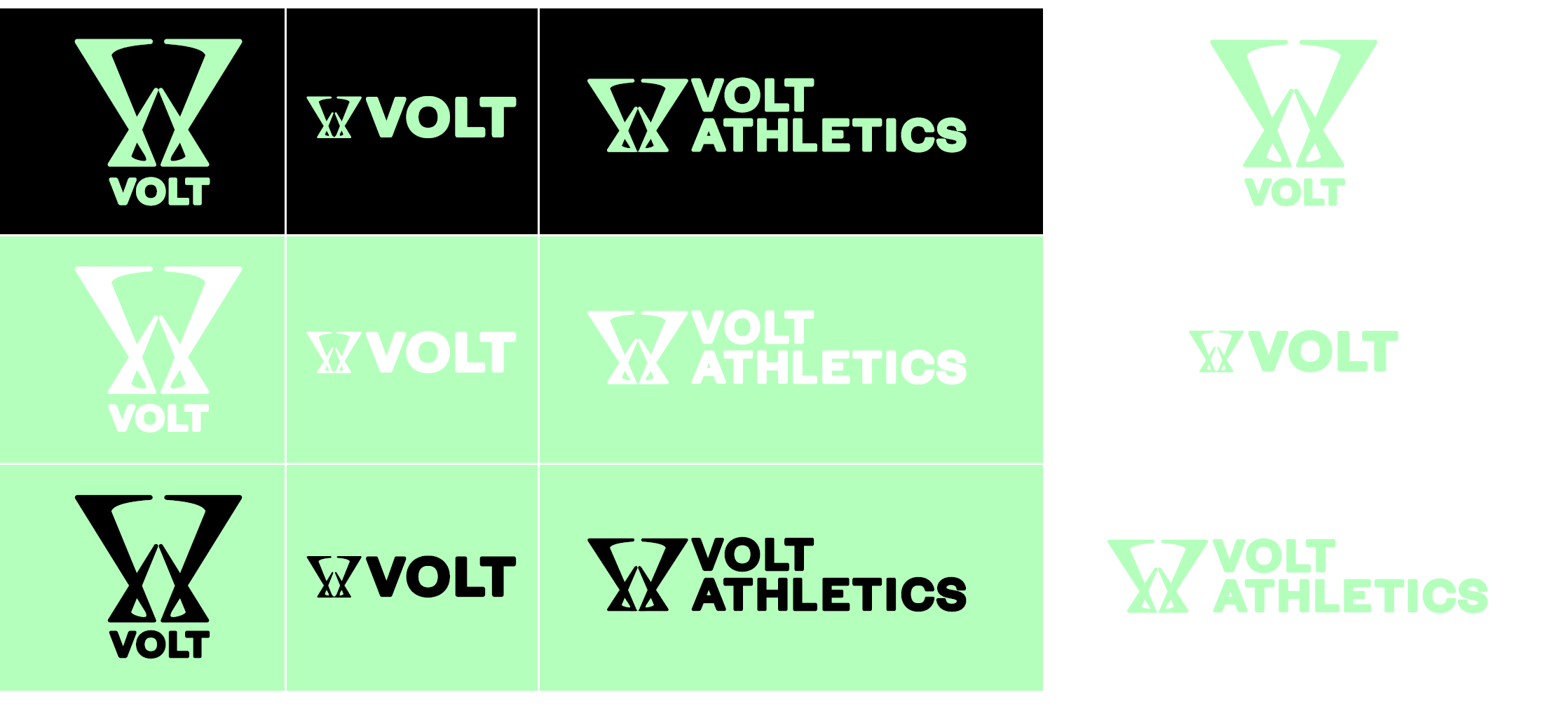
FINAL LOGOS
SOME FINAL MOCK-UPS
POSTERS/SIGNAGE
SOCIAL MEDIA POSTS
SITE
BACKGROUND
VOLT Athletics is an individualized workout app designed to fit everyone’s needs; on and off the field. Accessible and intiutive, they design workouts to intently build on any starting level.
VOLT believes everyone deserves access to amazing training.
Their mission is to make world-class, research-based workouts accessible to everyone, everywhere, and anytime.
Whether it’s training for a sport, job, or general health and fitness, they show users exactly what to do to reach their goals.
GOAL
With this brand redesign, I plan on making the experience even more personalized. I think the options for group-specific training are great, but I believe that it would be best to focus on an individual’s needs, with emphasis on people first starting out, and needing more assistance.
WHAT WILL CHANGE?
They still hold their mission statement and values, wanting to give everyone an accessible personalized experience when working out.
With this redesign, I wanted to focus and expand on their mission, with an emphasis on inclusivity of the users.
I understand each person has different needs and goals, and regardless of gender, and ability, my goal was to become an approachable brand that makes working out enjoyable and make the users feel at ease.
Starting with the logo, I placed more importance of how the users are not alone on their journey;
that we are connected.
RATIONAL
The brand has a “gym-bro” vibe, and from both personal experience and those around me, that can be intimidating. I think it is important to emphasis that working out and living an active lifestyle is for everyone!!
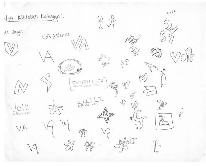
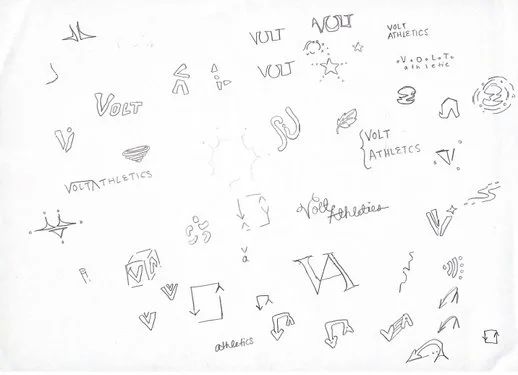
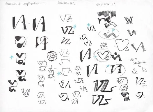
INITIAL SKETCHES
My first sketches, I played around with various directions, from typography to marks. I wanted to convey the “togetherness” aspect of my redesign goal.
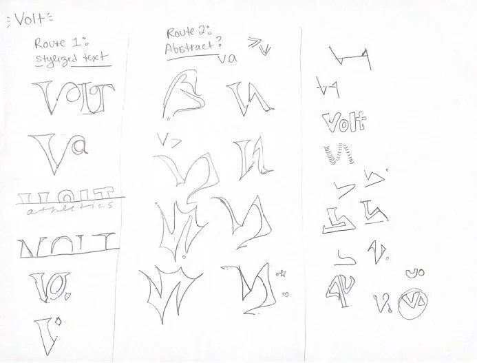
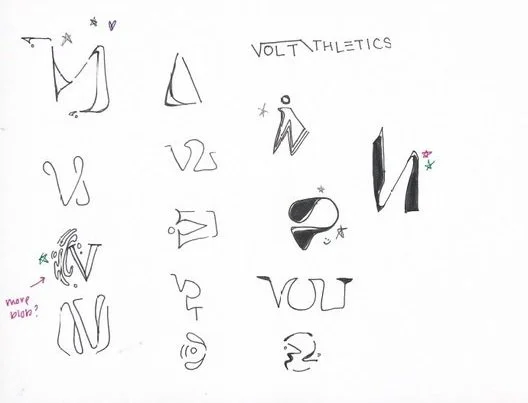
REFINEMENTS
I refined my directions, and received lots of great feedback. I still wanted to push the abstract mark.
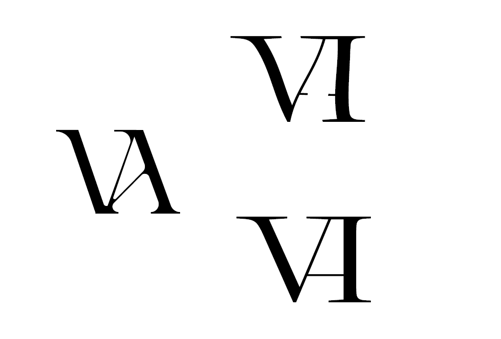
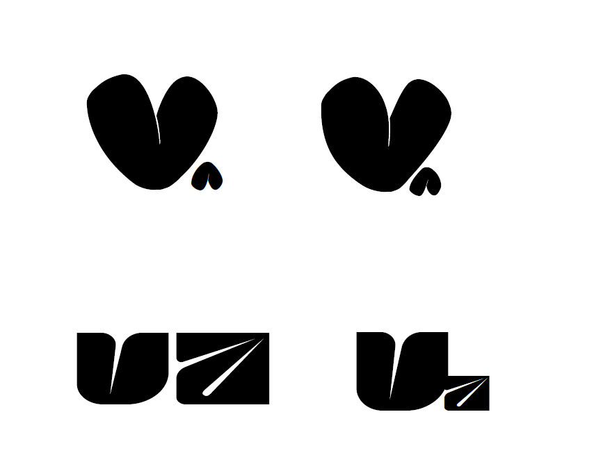
COMPUTER MOCKUPS
The first round of computer mock ups. I did the combine letters, but it felt a bit too sophisticated. On the other hand, the circular shapes was too soft.
More direction exploration. The type and gradient was interesting, but not giving the non-gendered direction I wanted. The abstract arrows was a good direction that I wanted to keep pushing.
FIRST FINAL ITERATION
My first final direction. I wasn’t happy with any of my directions, and revisited older sketches. I took the combination of the V and A logo together, the arrow direction, sharp abstract shapes, and the idea of “togetherness”.
However, the shapes didn’t fully convey my idea of “togetherness”, and it was too pointy.
FINAL LOGO
FIRST COLOR
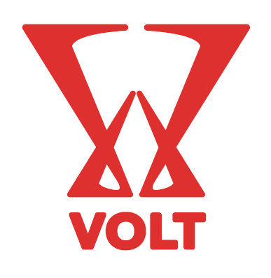
My final logo. I combined the V and A, to fully convey my message. I also changed the color to a purple-blue, to give it a more gender-neutral feel.
The font also changed to omit the athletics, with a softer curved bold type.
final logo
and color
The final primary color with color refinements. I wanted to give an energetic yet still gender-neutral feel.
Secondary type logo lock-ups.
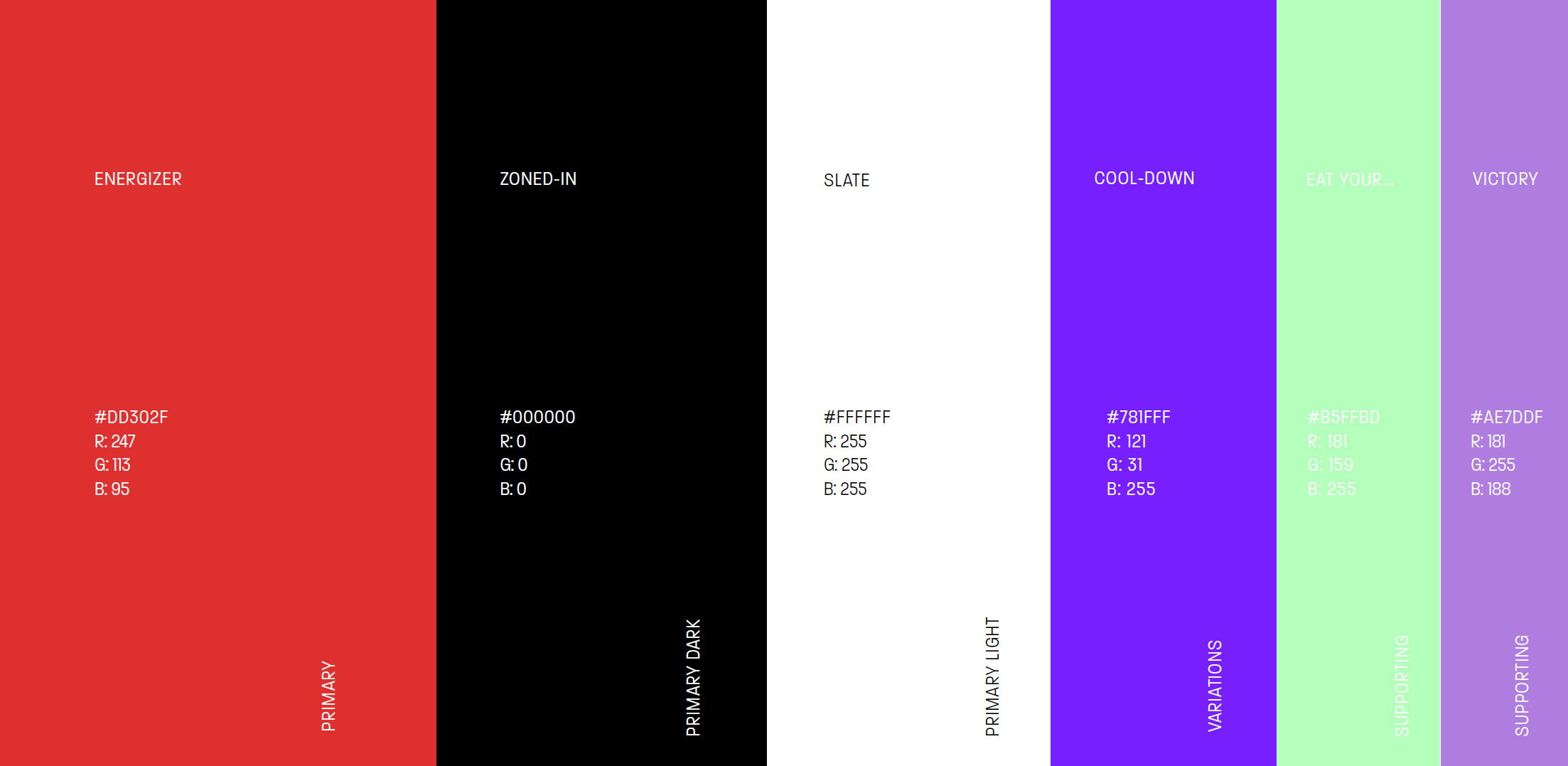
Color palette and usage.
TYPOGRAPHY
MAIN LOGO
HALYARD DISPLAY MEDIUM
Used in main logo text.
Primary type for large posters and social media.
SECONDARY
PARALUCENT CONDENSED THIN
Used in posters, social media posts, and merchandise.
Used sparsely as more decorative.
BODY COPY / APP TYPE
NEUE HAAS GROTESK DISPLAY PRO
Main type for app and websites. High legibility and readability.
MARK COLOR
VARIATIONS
INITIAL POSTERS
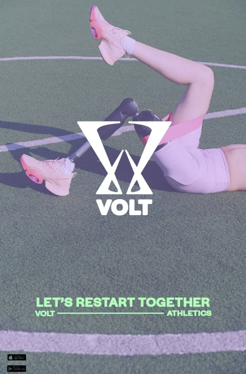
My first batch of posters. However, during critique it still felt too feminine.
FINAL POSTERS
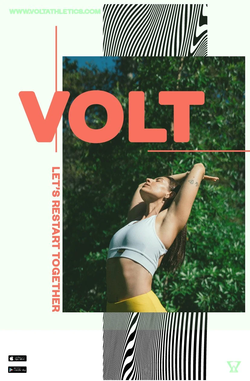
My final posters. I wanted them to be bold, with no gender demographic.
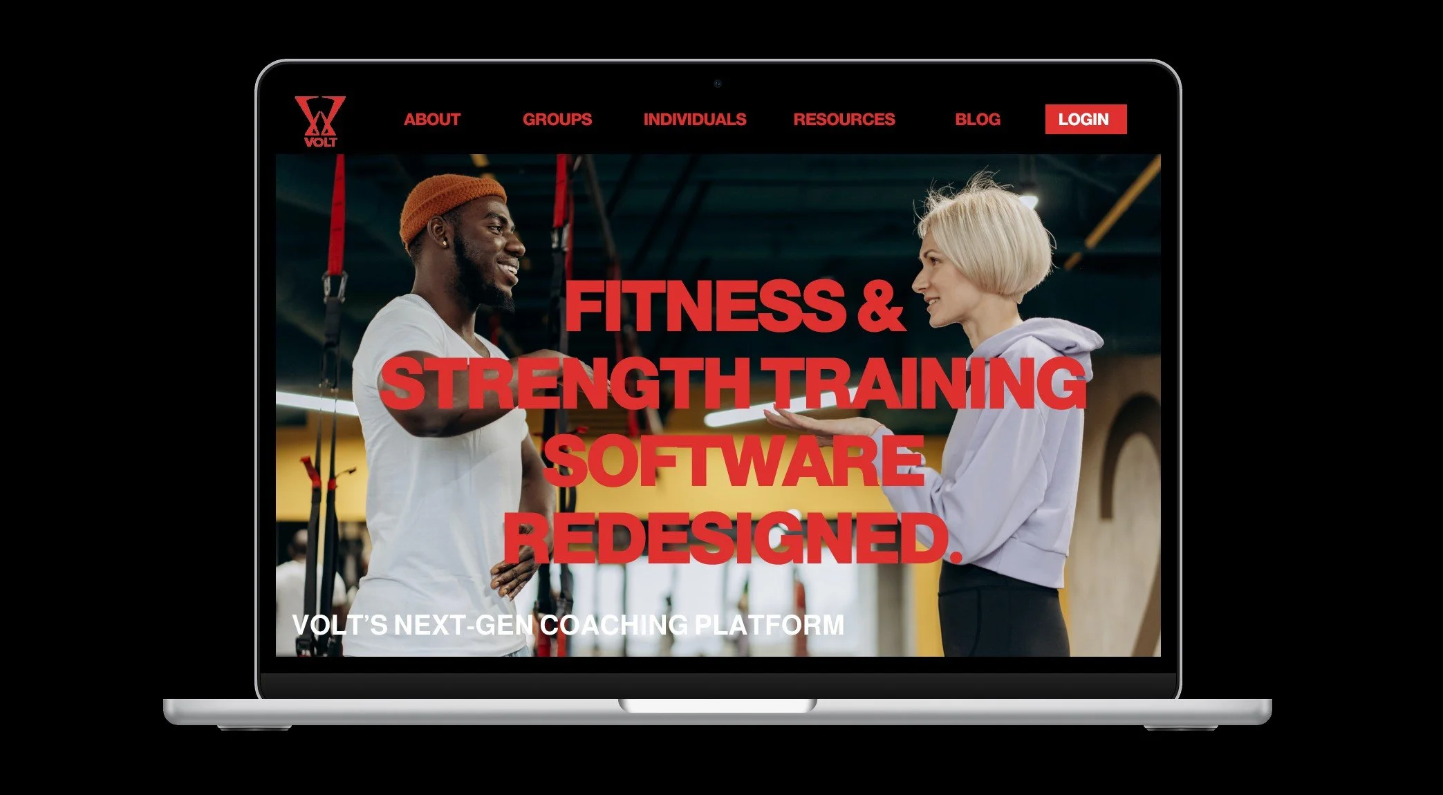
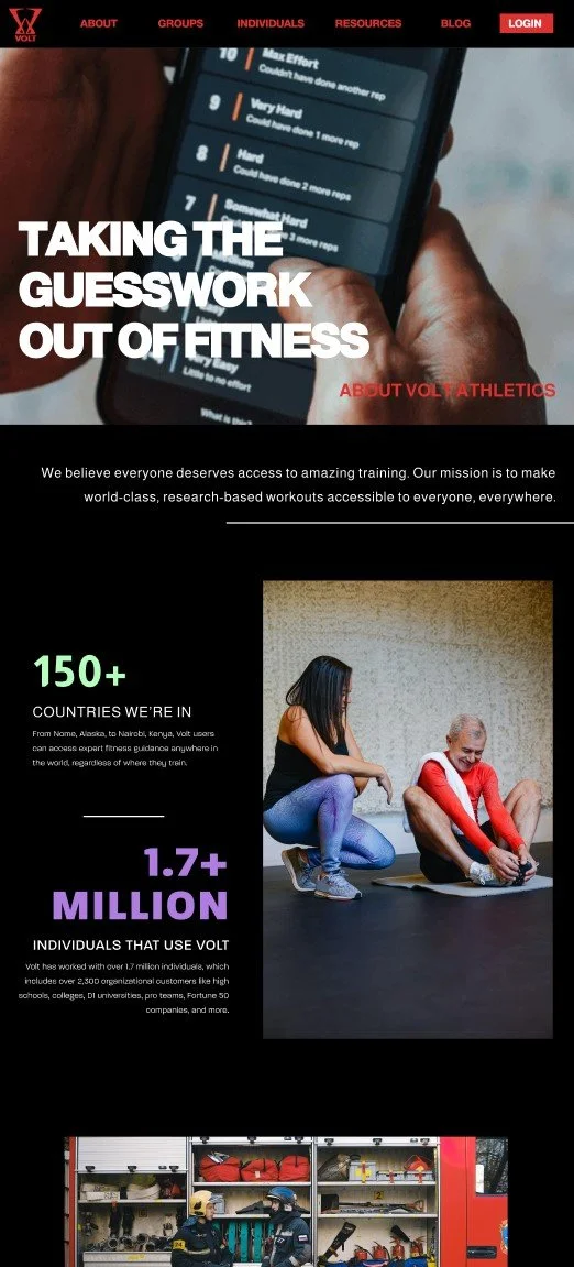
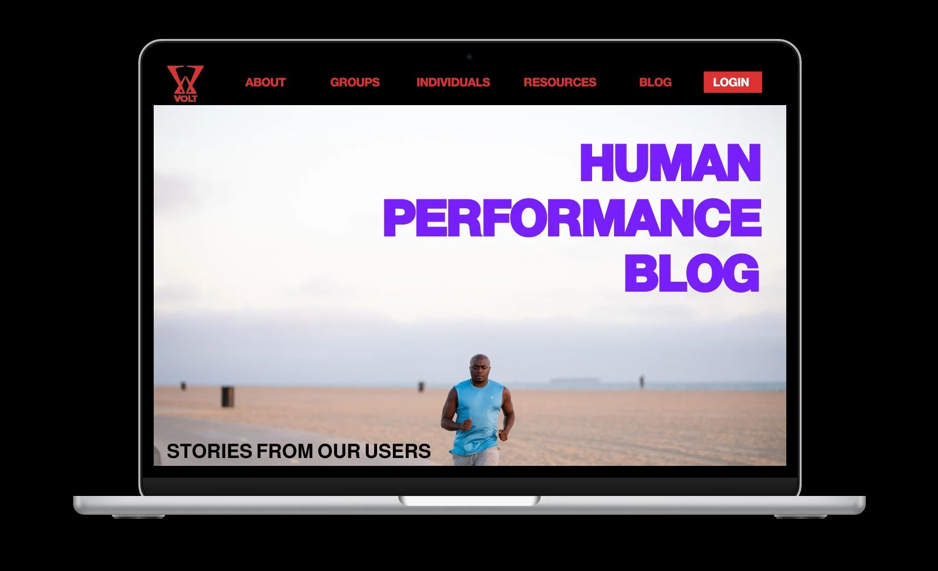
SITE REDESIGN
SITE HOME PAGE
SITE ABOUT PAGE
SITE BLOG PAGE
SOCIAL MEDIA
The instagram profile. Featuring the new logo and color palette, incorporated into the posts and story highlights.
Some example posts, featuring a variety of messages. From nutrition, to mental health awareness, and the new app features.
Instagram story.

