REDLIGHT KITCHEN+bAR
WEBSITE REDESIGN
This is a UI/UX project that was created using Figma. The goal was to take a local company’s site and redesign them to match their company.
WINTER 23
FINAL SITE
MOBILE
DESKTOP
BACKGROUND
The project requires a site redesign of a chosen local business. The client I chose to do was Red Light Kitchen & Bar, located in downtown Bellingham. Redlight Kitchen & Bar is a restaurant featuring Asian-Fusion food, cocktails, desserts, and more. With a sophisticated yet relaxed environment, their demographic is aimed towards 21-40’s. Their menu ranges around 15$ for an entrée, and 8$ for an appetizer. Drinks aren’t premade, when ordered online they come in “kits”, and those range from 20-60$ depending on bottle size.
PROBLEM
The problem presented was the site was lacking the atmosphere of the restaurant. The atmosphere in the restaurant is a big attraction, and even though they have beautiful photos of their items, I wanted to really showcase them.
SOLUTION
The solution to the problem was to do a site redesign. I chose to do a black website, with white text and red accents. I wanted to convey the feeling of the restaurant and have it reflected in the site. I also wanted to tailor the site to the demographic. I made sure the landing page included all the information necessary to the viewer, such as images of the food and space, a quick overview, hours, and location. I also wanted to give the restaurant an elevated, modern, sensual feel, to reflect the experience.
The biggest strategy I had was
to utilize the beautiful photos of
the food and bar items, and incorporate
matching types and visuals.
RESEARCH
I first did some field research, and stopped by for an evening. I got a good understanding of the vibes of the restaurant, and what message they were trying to convey to the patrons. I then checked out some similar restaurants online, ones with an aesthetic I was trying to emulate. I got some inspiration from pinterest, and looked at alot of high-end restaurant menus. I also got a lot of feedback on what was important to display on the landing page, especially for a bar, with people searching for hours immediately.
CONCEPT EVOLUTION
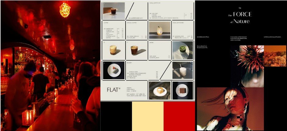
I chose the concept since it was the perfect blend of minimalism, and a somewhat “mysterious” vibe. Redlight isn’t too expensive place, but it definitely is considered higher-end than most restaurants in the area. My priority was to elevate these feelings, and to make the experience of being inside the restaurant reflect in the site. I improved user flow by displaying the interior as the landing page, with the necessary information readily available. The layout is widely spaced out, to help the reader, especially with the background being black. I then also made sure that the menu displayed a photograph of each item.
TARGET AUDIENCE
The target audience is people in their early 20’s and up. I think anyone 21+ can enjoy the restaurant, as long as they have a penchant for Amsterdam-style bars. However, I think to narrow the scope, it would be local people coming off work to enjoy some vegan Asian-Fusion and drinks.
VISUAL DESIGN
For the landing page, we spent some time figuring out the best direction. I initially had three, with some variety between them. The first two were received the best, and the third I scrapped. The moodiness was captured well in the first, and the second layout was well-received. My biggest takeaway was to combine these two ideas, into a cohesive site.
MINI MOODBOARD
PROCESS
INITIAL FIGMAS
CHALLENGES
I had never done a site redesign like this, and it was at first difficult for me to properly convey the atmosphere that I wanted. I also didn’t know how to make an effective landing page, and went through several iterations. I also spent a lot of time tweaking the menu, to both showcase the photography and to keep it aesthetic.
REFLECTION
I learned quite a bit from this project, from getting a better understanding of how figma works, and how to create an effective page. I also learned the importance of what information to showcase depending on the client. For this project, it needed to clearly show the hours and location, as well as the interior. Even though I didn’t apply it to this project, I also learned a lot about how to create an effective “call to action” for the user.
FUTURE GOALS
I think there is potential to expand this project. I had a lot of fun redesigning one of my favorite restaurant and bar, and I am happy with how it turned out. I think I want to do a bit more in terms of displaying more bar items, and giving more homage to the interior.


