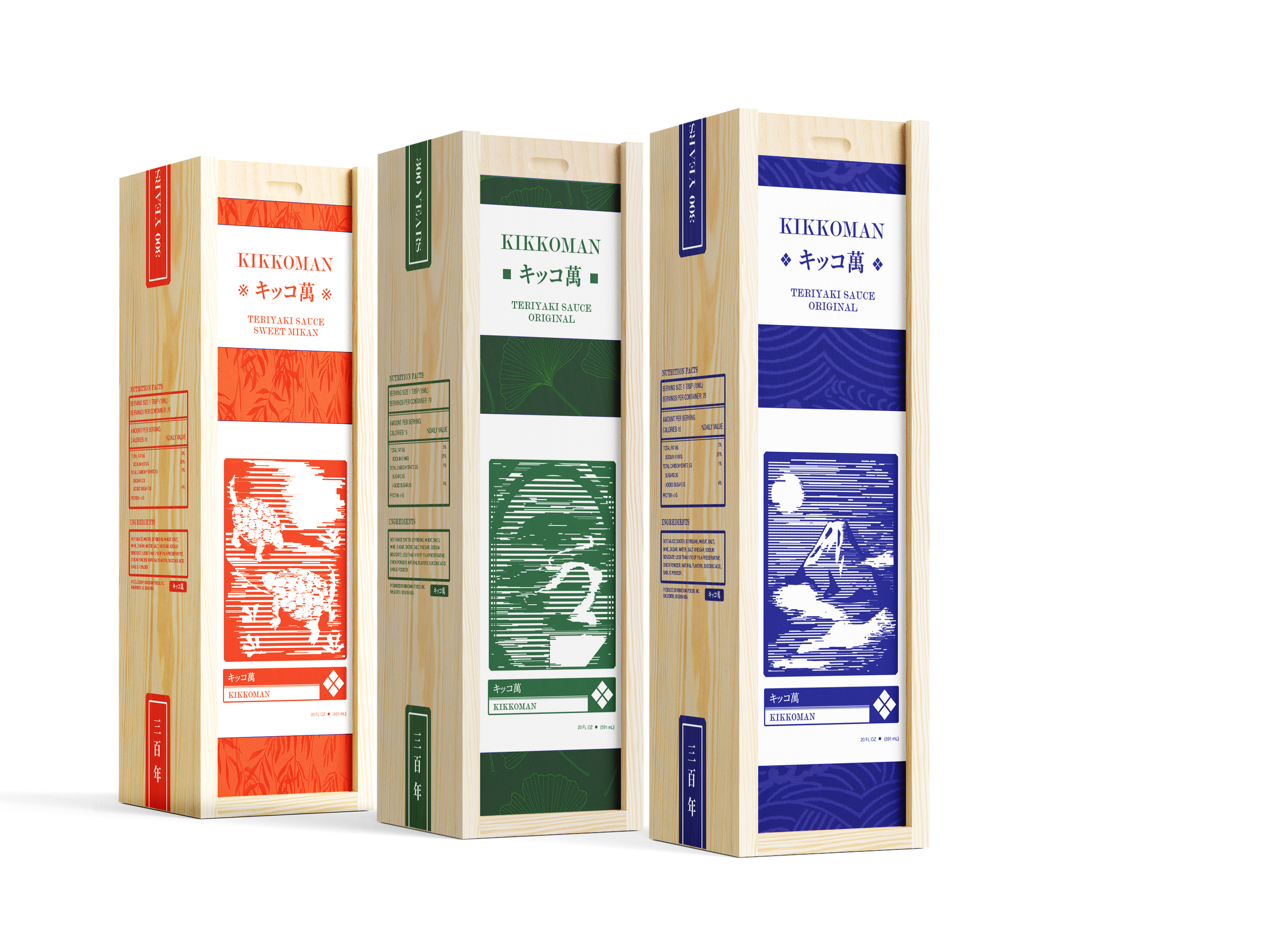
This was a packaging project taking the Kikkoman Teriyaki sauce label and redesigning it. My main goal for this redesign was to honor their roots, and bringing it back to their history.
KIKKOMAN TERIYAKI
PACKAGING REDESIGN
FINAL MOCKUPS
Final bottles.
Gift boxes.
One of the matching chopstick sets.
BACKGROUND
Kikkoman Corporation is a Japanese food manufacturer. Its main products and services include soy sauce, food seasoning and flavoring, mirin, shōchū, and sake, juice and other beverages, pharmaceuticals, and restaurant management services.
West Japanese-style soy sauce, called shoyu, has been a well-known condiment for over 300 years. Kikkoman is the largest shoyu manufacturing company in the world, and known to be the one most responsible for introducing shoyu to western countries.
The goal of Kikkoman is to expand the use of traditionally brewed soy sauce by showcasing its magical versatility as a flavor enhancer in a wide variety of foods, from Asian to mainstream American. Their mission is to make this ancient yet contemporary ingredient an essential part of the fabric of American life.
In Japanese, kikko means “tortoise shell” and man means “ten thousand.” In Japan, the tortoise is a traditional symbol of steady progress and longevity, since, according to Japanese folklore, the animal is believed to live as long as ten thousand years.
SHOYU
醤油 ショウユ
SOY SAUCE
OBJECTIVE
The item and line I want to redesign is their Teriyaki Marinade. My biggest purpose is to honor their mission statement and goals, by creating a design that showcases their longevity and essentiality of the product. Asian sauces have now become a staple in American pantries.
I feel as if their packaging for their Teriyaki line doesn’t fully reflect the heritage of the brand itself. Given how iconic the soy sauce line is, it feels like there is less aligning recognition with this line, and a lack of cohesion.
The teriyaki packaging design appears to cater to their American audience who is not familiar with the product. I want to change this perception, given that Kikkoman is a recognizable brand, and Teriyaki sauce is now a commonplace item in modern households.
TERIYAKI NO TARE
照り焼きのたれ
TERIYAKI SAUCE
The most important message would be the conveyance of Kikkoman quality, and fusion of an American brand that conveys the long Japanese heritage and history. The design will pay homeage to this, whilst modernizing their Teriyaki image.
The customer should be able to understand the importance of Kikkoman’s history, and enjoy the aesthetics of the design. The imagery of meaning of Kikkoman itself should be apparent, such as the turtle meaning in Japanese history and culture.
TAKEAWAY
The visual tone of my message will be
clean, modern, and pays a
homage to its Japanese background with
supporting visuals.
INITIAL SKETCHES
FINAL DESIGN FLATS
I looked at traditional Japanese stamps, and emulated them in the main design. In between the back and front, I chose to use the kanji in the logo. I wanted to highlight their longevity by bringing attention to their 300 year history, and to include a note on what the name means.
For the main sauce, I chose to do a Mount Fuji stamp. The mountain appears in many traditional art pieces, and is one of the main symbols of Japan.
For the second sauce flavor, I chose to do a design with turtles. Kikko means turtle, and is symbolic to the brand.
Finally, for the third flavor, I decided on a bonsai tree stamp. I recently learned in class that in the Japanese preforming arts Kyougen, there is always a bonsai tree mural. I thought it was a fitting traditional symbol of Japan.
TABS
Here are the wrap labels on the top of the bottle. They easily notify the customer of the flavor.


